top of page
OVOMCARE CASE STUDY
2024
ENHANCING
ACCESSIBILITY & USABILITY
OF A FERTILITY WEBSITE
Increasing accessibility to 60% and boost user engagement to 30%
Project type: UX/UI
Case study timing: 2 weeks
Role: UX/UI Designer
Tools: FIGMA, MIRO
.png)
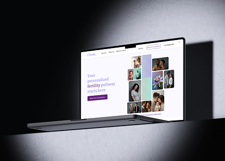
Ovomcare is a healthcare website designed to provide fertility solutions and support for individuals and couples looking to conceive. The platform primarily targets people facing fertility challenges and offers comprehensive services, including fertility monitoring, consultations, and personalized care plans.
Before / After
01
The old design struggled with low contrast and a confusing top navigation, making it hard for users to find what they needed.
02
Now, with improved contrast and an effective top navigation, everything’s easy to find; no more endless scrolling!
Before
+Low Contrast
+Ineffective Top Navigation
After
+Enhanced Top Navigation Bar
+High Contrast
PROBLEM STATEMENT
We all know how much emphasis is put on making websites visually appealing and user-friendly, but there’s one key element that often gets overlooked; accessibility. Did you know that 1 in 5 people face accessibility challenges when using the web? That’s a significant number, and it’s just as crucial as usability and aesthetics. In this case study, I’m focusing on how Ovomcare’s website can be transformed into a more accessible and organized experience, ensuring that everyone, regardless of their abilities, can navigate with ease. Let's dive into how we can make this happen!
SOLUTION
Design a more accessible and user-friendly website for Ovom Care! To achieve this, I will develop user personas to understand the needs and challenges of our diverse users, particularly focusing on accessibility. I will utilize a color contrast checker to ensure the site meets accessibility standards, and conduct preference tests to refine usability based on real user feedback.
GOAL
My goal is to redesign the Ovom Care website by focusing on improving accessibility and usability to better meet the needs of all users. I will prioritize features such as better color contrast, larger fonts, and clear navigation to ensure a more inclusive and user-friendly experience.
COMPETITOR ANALYSIS
For the competitor analysis, I reviewed London Women’s Clinic and Kinderwunsch websites. This helped identify gaps in navigation and accessibility, which help me improve to the Ovom Care site.
01


Poor Accessibility


Intuitive navigation bar
02


Overloaded Top Navigation Bar

High Accessibility in CTA Design

A sitemap is crucial for Ovom to illustrate the website’s reorganization and redesign of the dropdown menu, which improves navigation efficiency. This update will enable users to access the necessary screens directly, rather than scrolling through the entire site as required by the current design.
ENHANCING TOP NAVIGATION BAR

BETTER ACCESSIBILITY
Here are the accessibility results of the Ovom website and the enhanced version. The previous design struggled with low contrast ratios and small, difficult-to-read fonts, whereas the updated version features improved contrast and larger text sizes, significantly enhancing readability and overall accessibility for all users, especially those with visual impairments.
#1 Increased Color Contrast


#2 Accessible Fonts Bigger Font-Size Option
With the addition of an A+ magnifying icon, users can now adjust the font size effortlessly to match their reading preferences. This simple yet powerful feature improves accessibility by allowing individuals, especially those with visual impairments, to personalize the text size and enjoy a more comfortable browsing experience.


STYLE GUIDE

I developed components that enhanced accessibility across the Ovom Care site, including typography, colors, and interactive buttons. I transformed these elements into accessible components, ensuring consistency and usability, and combined them into features like CTA s and labels that users interact with throughout the prototype, focusing on readability and ease of navigation for all users.
.png)
.png)

bottom of page

